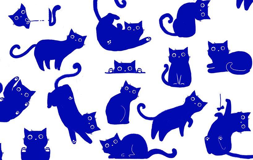
this adorable blue cat moves across the milk packaging by russian agency depo
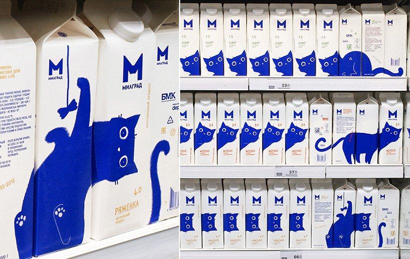
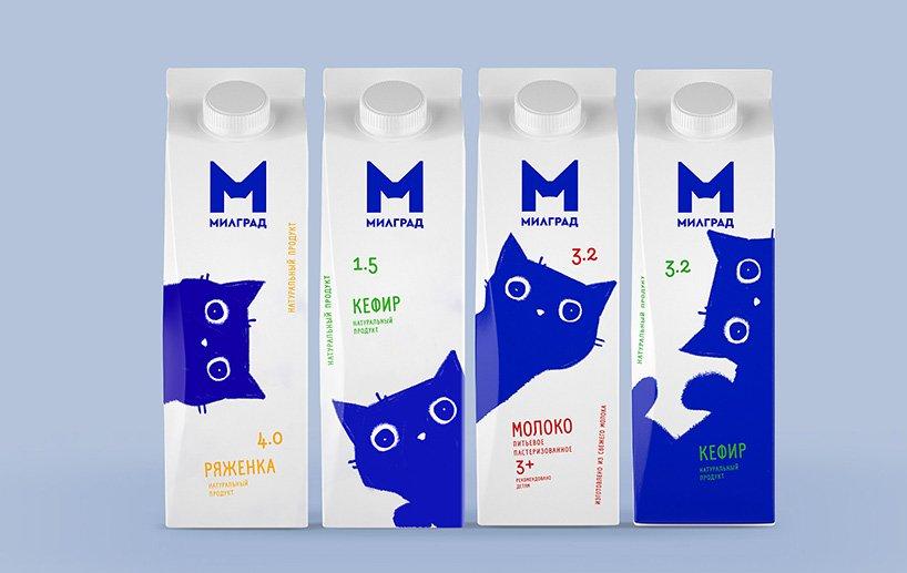
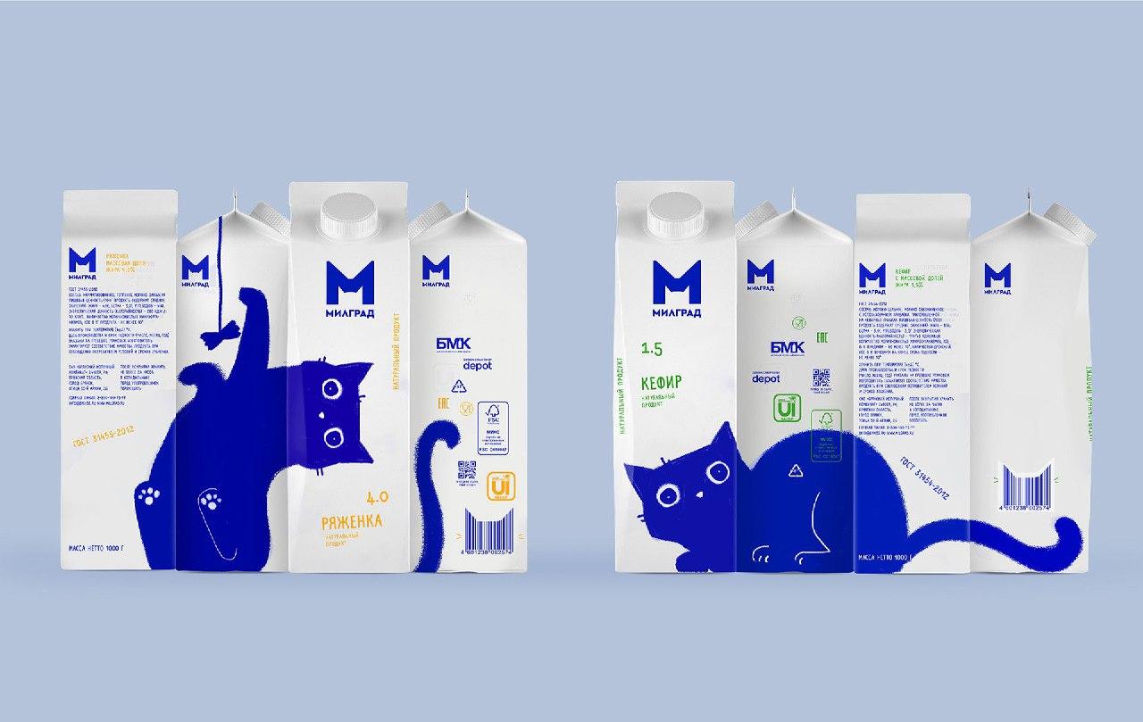
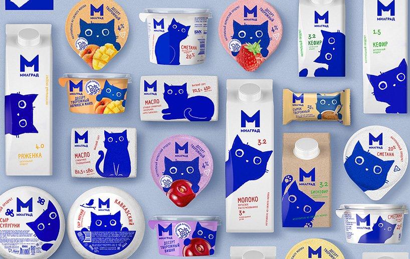
Designboom_russian design agency depot has developed the new branding identity for milgrad’s bryansk dairy plant. knowing that the dairy market occupies more than 22% of the FMCG food product structure, the design aims to stand out on the dairy shelf, increase sales, expand the geography of representation and distribution channels while showcasing a humorous, kind and sweet response. the result? a blue cat that travels through the package, creating different narratives as users rotate the package.
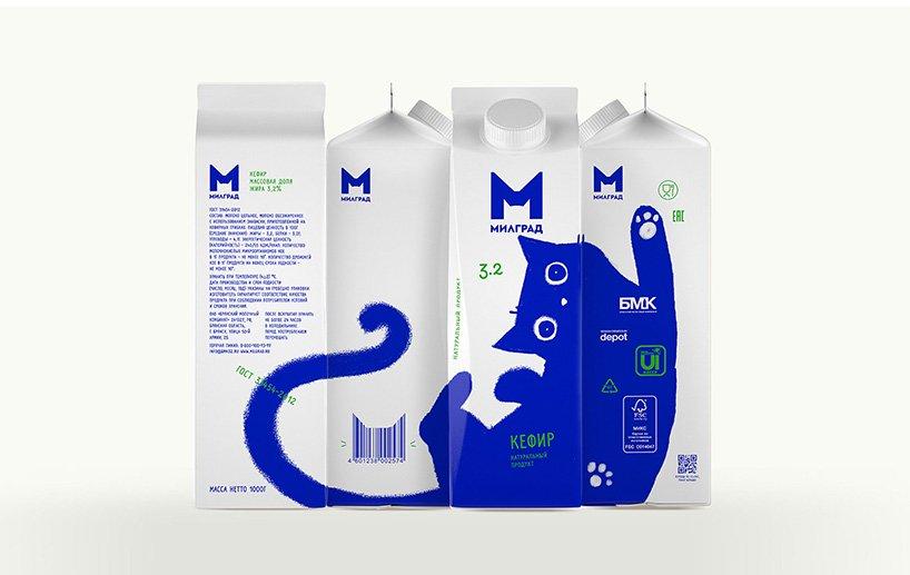
for this packaging redesign, depot created a blue cat that looks at the consumer with interest, plays with a string, locks out of freezes in anticipation. the illustration moves from one side of the package to the other, creating additional shelf display options. although the concept was inspired by brunhilde, the cat was created by vera zvereva, art director at depot, and features many habits cat owners will recognize from their pets.
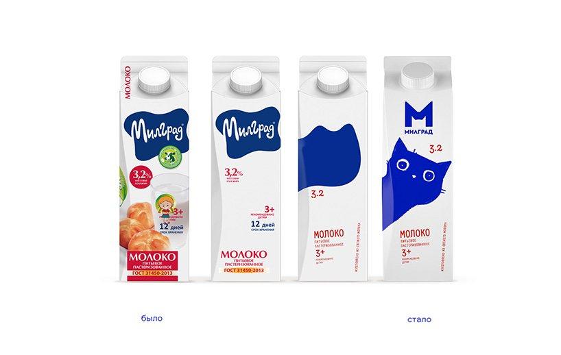
we started our work from three main positions: milk, fermented baked milk and kefir,’ comments the agency. ‘we tried to divide the products using color coding characteristic of the categories – green for kefir, light brown for fermented baked milk and white for milk. from different combinations, we, together with the client, came to a more minimalistic solution and decided to leave the main color of the packaging white, and the illustrations in a single blue color, this kept the connection with the colors of the brand, which has been known to consumers for many years. ryazhenka, kefir and milk differ from each other by the color of the font. all differentiating texts on the packages are in the corresponding color category.’